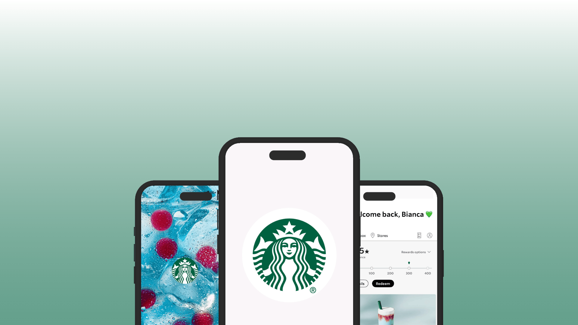
Starbucks App Redesign
Driving Clarity, Conversion, and Engagement Through Smarter Navigation
July - 2025
Context
The Starbucks mobile app is one of the company’s most important digital assets. It concentrates mobile ordering, in-store payment, loyalty, and product discovery into a single experience that directly impacts revenue, customer retention, and operational efficiency. Over the years, the app has achieved strong adoption, especially among frequent customers who use it weekly for Mobile Order & Pay or in-store payment.
Looking ahead to 2025, Starbucks has publicly reinforced its focus on digital growth, faster and more efficient ordering, stronger personalization, and increased beverage sales. However, despite its scale and maturity, the app still shows signs of friction. Customer feedback and usability reviews consistently point to challenges related to navigation clarity, rewards understanding, product discovery, and ordering efficiency. These issues do not prevent usage, but they quietly limit conversion and engagement potential.
This case study explores how a redesign of the app’s structure can unlock that potential.
Hypothesis
If the Starbucks app surfaces clearer, more actionable information at the right moments through a redesigned header and a conversion-optimized layout, users will navigate the app more intuitively, better understand rewards, discover beverages more easily, and complete orders with greater confidence.
MAKET ANALYSIS
Across QSR, retail, and consumer apps, there is a clear trend toward simplifying decision-making through strong visual hierarchy. Leading apps prioritize showing users what matters most immediately, reducing the need for exploration and excessive scrolling. They use compact cards, persistent headers, and contextual nudges to guide behavior without overwhelming the user.
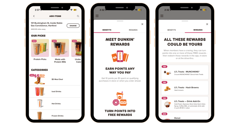
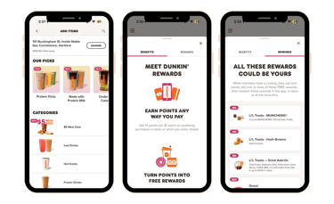
Dunkin’s mobile app focuses on quick ordering and visible offers, with a straightforward menu and loyalty progress. Compared to Starbucks, Dunkin emphasizes deals and rapid access to favorite items with fewer layers of navigation.
Dunkin' App
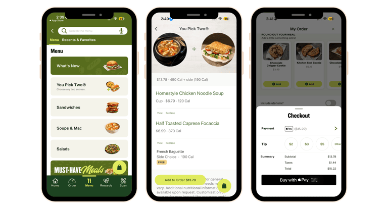
Panera Bread App
Panera’s app integrates flexible payment options and emphasizes order customization with quick checkout pathways. Its rewards system focuses on surprise perks rather than strict point thresholds, offering a different engagement model.
Starbucks leads in loyalty engagement and brand experience. However, competitors use different strengths to challenge Starbucks in key areas. The Dunkin’ app prioritizes rapid order-ahead and visible offers, reducing navigation layers and promoting frequent deal-driven purchase behavior. Panera Bread emphasizes fast checkout with direct wallet payment options and flexible ordering flows, appealing to users who want simplicity and speed without preloading funds. Together these comparisons highlight areas where Starbucks can borrow clarity and conversion cues to reduce cognitive load and enhance immediate value discovery.
Audience
Starbucks app users range from frequent daily purchasers to occasional visitors. The core segments are Millennials and Gen X, who rely on digital ordering and rewards to streamline their visits and track their loyalty progress.
Core Digital Audience
Ages: A broad range from late teens to mid-50s, with heavy usage among Millenials and Gen Xers.
Behavior:
Value speed and simplicity in ordering
Use the app to plan and prepay before store visits
Strong interest in promotions, rewards, and seasonal offerings
Depend on the app for efficient in-store payments and loyalty progress visibility
Personas:
Routine Commuters
Remote-First Employee
Weekend Socializers
Rewards Seekers
Trend Followers
Ocasional & Opportunity Users
Ages: Late 30s to 60s
Behavior:
Visit Starbucks irregularly
Don’t use the app on every store visit
Can be confused by navigation or reward mechanics
Personas:
Senior
Infrequent Visitors
New App Adopters
User Insights
Customers want to explore new drinks but often miss seasonal offerings
Many customers miss new beverages because they are not immediately visible. Navigation constraints limit how many beverages can be shown on the main screen, reducing discovery and experimentation.
Mobile ordering introduces another friction point
Users frequently select the wrong store or feel uncertain about pickup details, leading to frustration and inefficiency. The ordering flow works, but it requires repeated confirmation and attention that could be reduced with smarter defaults and clearer feedback.
Rewards represent one of the biggest missed opportunities
While most users know they have Stars, many do not understand how to maximize them. Redemption thresholds are unclear, and the app places too much responsibility on store staff to educate customers in person.
Social Media–Driven Beverage Customization
Many Starbucks customers discover new drinks through social media and arrive with viral recipes they want to order. The app does not support this behavior, forcing users to rely on screenshots or barista explanations instead of a seamless digital flow.
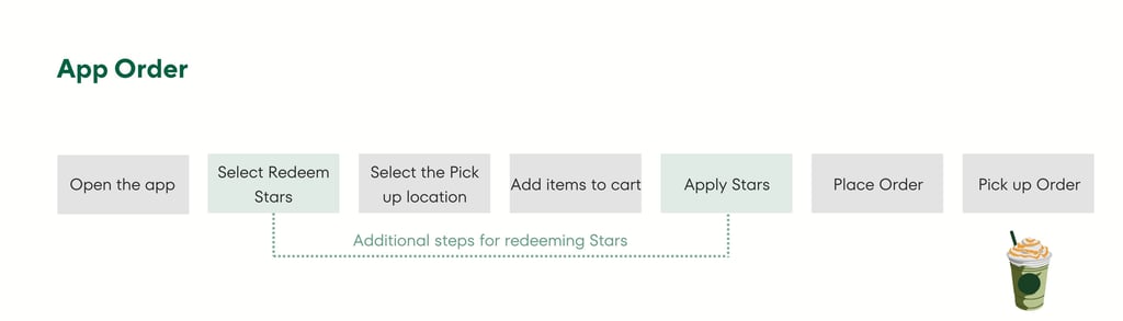
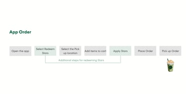
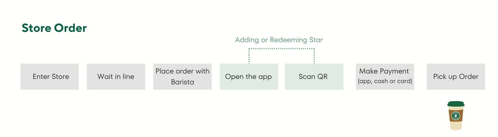
User Journey
Even frequent users are required to repeat steps that could be persistent, such as selecting their pick up store. Additionally, rewards are not seamlessly integrated into the journey, as they cannot be applied once items have already been added to the cart.
How users achieve a goal inside the app?
Key Insights
The app does not suffer from a lack of features, it suffers from a lack of clarity.
Rewards are a strong lever but under-utilized due to poor education
Visual hierarchy directly impacts conversion
Cultural trends (social media drinks) are already influencing behavior, but unsupported digitally
Problem Definition
The Starbucks app’s core problem is that critical information and actions are fragmented across the experience, forcing users to think, search, and repeat steps instead of guiding them clearly toward discovery, rewards usage, and purchase.


Goal
Make ordering coffee effortless and intuitive by guiding customers to the right choice with minimal steps and clear, actionable cues.
Core Features
What should be changed to improve the experience?
For delivery more value through the app is necessary restructure what users see first and how quickly they find meaningful information.
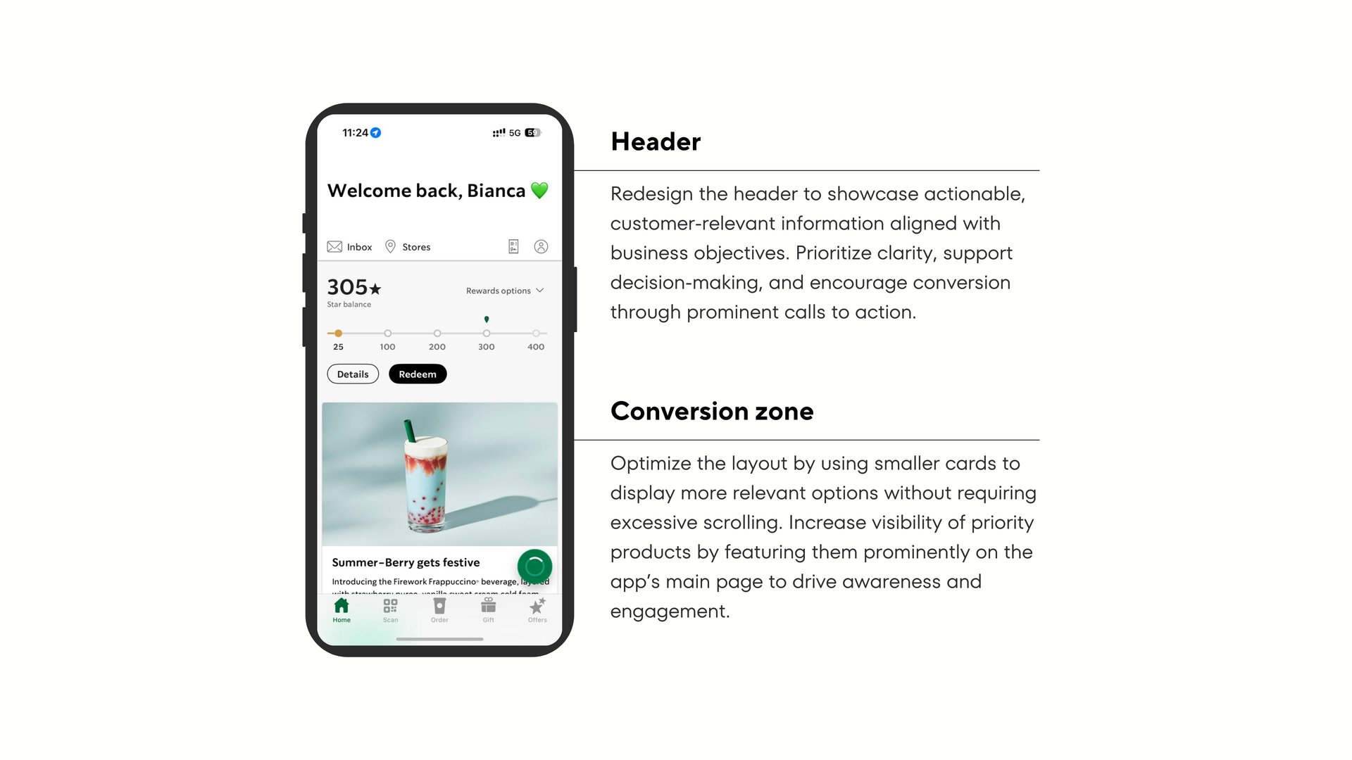
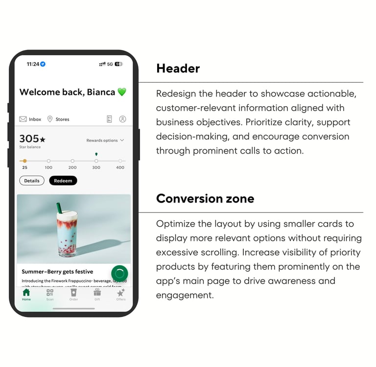
Redesign Header
As a Starbucks app user, I want to quickly see my Stars balance and progress so I know when I’m close to a reward.
As a user, I want clear calls to action (Order, Rewards, Seasonal) so I don’t need to search.
Conversion Zone
As a user, I want to see more drink options at once so I can discover something new.
As a user, I want seasonal and trending drinks highlighted clearly so I don’t miss them.
Seasonal Beverages Visibility
As a user, I want seasonal drinks to be visually highlighted so I know what’s new.
As a user, I want to quickly explore flavors without navigating deep menus.
Mobile Order Efficiency Improvements
As a user, I want the app to auto-select my last store but clearly allow changes.
As a user, I want to clearly see pickup location before and after ordering.
Rewards Clarity
As a user, I want to understand what my Stars can get me.
As a user, I want suggestions like “Use your Stars for this drink” at checkout.
Internet Trends Integration
As a user, I want to find trending drinks directly in the app.
As a barista, I want standardized recipes so trending drinks are easy to prepare.
Solution
Redesigning the Starbucks app to improve clarity, speed, and conversion.
Introducing a smarter header with Stars balance, progress, and clear CTAs
Creating a conversion zone with compact cards to surface more options instantly
Elevating seasonal and trending drinks to top-of-screen visibility
Simplifying mobile order flows with better store selection logic
Turning rewards into guided, contextual nudges.
Not static information
Risks
While improving the Starbucks app experience can unlock stronger engagement and conversion, several risks must be considered to ensure the redesign delivers value without negatively affecting the broader ecosystem.
Stored Value Dependency
01.
02.
The Starbucks app relies heavily on customers preloading money into their Starbucks wallets, which functions as a stored value system and supports repeat purchases. If the redesigned experience prioritizes alternative payment methods or reduces friction for non-wallet transactions, it could unintentionally decrease wallet usage and weaken the financial benefits of stored customer balances. The redesign should maintain strong incentives for customers to continue using the Starbucks wallet and rewards system.
Algorithmic Promotion Bias
Highlighting seasonal beverages, trending drinks, or priority items on the homepage may unintentionally concentrate customer attention on a small set of products. Over time, this could skew purchasing behavior toward only highly promoted beverages, limiting discovery across the broader menu.
03.
Menu Complexity vs. Store Throughput
Encouraging greater beverage discovery, customization, and trend-driven orders could increase operational complexity for baristas, especially during peak hours. Highly customized drinks may take longer to prepare, potentially affecting store throughput and service speed. Any product changes that promote customization should be designed with store operations in mind to ensure digital growth aligns with in-store efficiency.
Measuring Success
North Star Metric
Weekly Beverage Orders per Active User
In a successful scenario, the metric should show a steady increase in beverage orders per active user, indicating that customers are not only using the app more often but also completing purchases more easily.
Leading Indicators
Session-to-Order Completion Time
How quickly users complete an order after opening the app. A decrease indicates the ordering experience is becoming more intuitive.
Wrong-Store Order Reduction
How often users accidentally select the wrong pickup location. A decrease indicates clearer store selection and ordering confidence.
Lagging Indicators
Beverage Conversion Rate
The percentage of sessions that lead to a beverage order. Growth signals improved purchase intent and conversion.
App NPS and Usability Feedback
Customer satisfaction and usability scores indicate whether the redesigned experience truly improves perception and ease of use.
Closing Insights


This redesign focuses on a simple but impactful principle: making the Starbucks app work the way customers already think and behave. By improving navigation clarity, surfacing rewards more transparently, and prioritizing high-value actions like ordering and beverage discovery, the experience becomes easier to understand and faster to use.
Rather than introducing entirely new features, the proposal emphasizes restructuring the existing experience to better align with customer needs and business goals. When the right information appears at the right moment, customers can move seamlessly from exploration to purchase, while Starbucks benefits from stronger engagement, higher beverage conversion, and more effective use of its loyalty ecosystem.
Ultimately, the success of this redesign would not only be measured by increased orders, but by creating an app experience that feels intuitive, helpful, and naturally integrated into customers’ daily routines.

Get in touch
Interested in working together or discussing product opportunities? Let’s connect.